The 5 Best and 5 Worst Gold Kits of All Time

Gold is always a daring choice of colour for a football shirt. There are more cases of it being used than you might think, but we've picked out our five best and five worst.

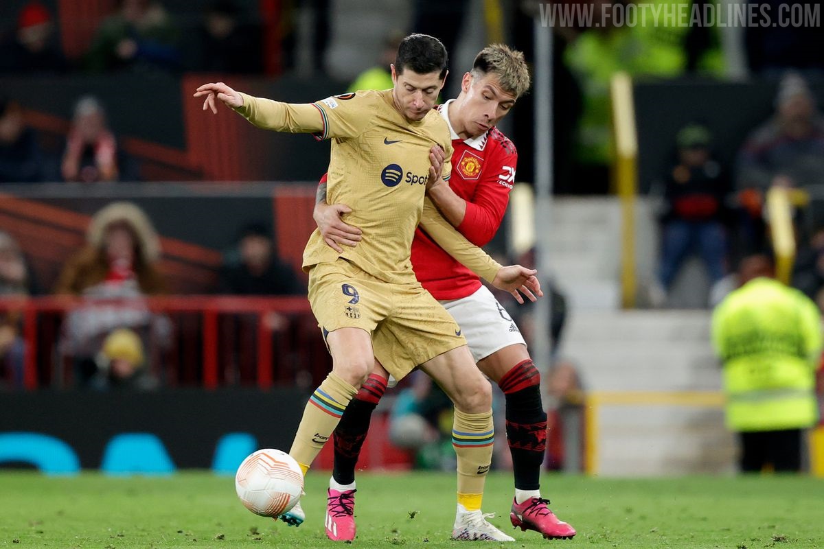
Gold Football Shirts
Gold will forever be associated with luxury, wealth, status and success. It's a bold choice to use as a main colour on a football kit not only for the implications it carries, but also because it's a difficult look to pull off. Footballers have the advantage of wearing a full kit designed be balanced, but fans should probably steer clear as a rule of thumb. When done well, a gold jersey can look great, but not every effort comes out so polished. In no particular order, here are our picks of the best and worst ever gold kits.
5 Best Gold Kits - Arsenal 01-02 Away


Shiny is good when it comes to gold shirts. Brightly coloured accents are generally bad, but Nike limited the use of red to the shoulder piping and the badge so it doesn't interfere too much. Just the right amount of navy means it's well-balanced overall.
Marseille Third 98-99


Shiny is good, so very shiny is very good. A retro-looking OM badge is also a nice touch here, while the navy collar and underarms compensates enough for the white stripes on the shoulders.
Milan Special GK 22-23


Just released a couple of days ago, the goalkeeper shirt from Milan's Koché collaboration is a stunner and was the inspiration for this list. It's a real shame that it will only be worn once and likely forgotten by most. It's a wonder they didn't make it the outfield kit.
Venezia Away 22-23


It's a ballsy move for a historically unsuccessful team to release a gold jersey, so this shirt needed to be a good one. And it was. Again, the sheen here is glorious. Spectacularly golden. The ratio of gold to black is also excellent, and the Kappa logo, blackout Venezia badge and text on the front are all stylish in their own right.
Milan Third 13-14


Maybe the shiniest jersey ever? You know what that means. The tricolour above the Adidas logo and the pocket-style stitching around it make it stand out too. Good work on the red accents being proportioned so well.
5 Worst Gold Kits - Arsenal Away 15-16


Too much navy. Strange shade of gold that fades in and out. The diamond pattern takes away from the shirt rather than adding to it. No positives here.
Copenhagen Special 12-13

To celebrate winning their 10th national championship, Copenhagen released a pair of kits, this one and another with the colours inverted. A white shirt with gold trim is fine. A gold shirt with white trim, especially this much white trim, not so much. Keep it dark.
Benfica Away 11-12 and 04-05


Two entries in one here from Benfica. A bad template is largely responsible for the 11-12 shirt's place on this list. The polo collar, and the amount and positioning of the black sections do nothing for it, while the shade of gold is a little washed out. The 04-05 shirt had red trim only with nothing darker to counteract it.
Marseille Third 08-09


Marseille foolishly scaled back on the shininess for their second gold number, and the result was this dull, uninspiring shade. It was also available with those three quarter length sleeves that Adidas experimented with around 2008. They did it no favours either. One of Adidas' stranger ideas.
Lyon Away 07-08


Kit makers, take note. If you're using a busy-looking, modern template, don't choose gold as a main colour. It should be reserved for more simple designs. Also, don't apply blue and red trim on a gold shirt together, ever.
(Dis)honourable Mentions - Barcelona Away 22-23


The Olympic ring coloured cuffs put a fresh spin on this one, and the city map in the weave looks good too. The matching socks and shorts are a little too much though.
Juventus Away 08-09


A nice simple template that's suited to such a statement colour. Switch the white v neck out for a black one and you're on to a winner.
Manchester United Third 01-02


This was two shirts in one, as it was reversible, with the away kit found on the inside. Umbro got the secondary colour right here, and it did have a bit of shine to it, but somehow the whole thing just looks tacky more than anything else.
What do you make of our selections? Are there any glaring omissions? Let us know what you think in the comments.


