Anything But a Revolution: Swedish Club AIK Update Logo
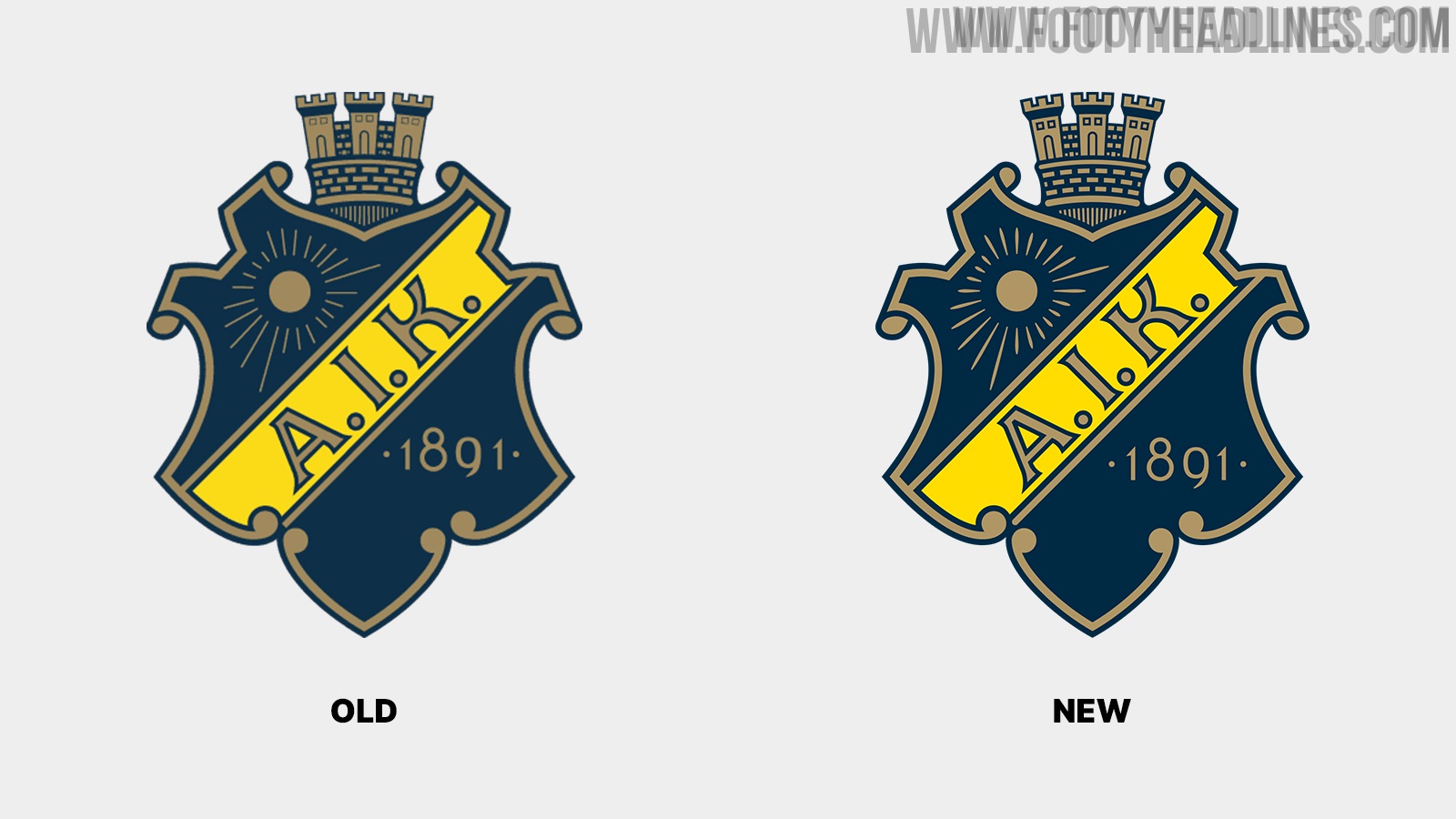
Swedish club AIK Fotboll have updated their club crest. The new AIK logo is a small update of the previous crest that has been more or less the same since 1975. Thanks to @WorldClubCrests for making us aware.

AIK's minimal update stands in stark contrast to Juventus, Gamba Osaka, and many other teams
AIK subtle crest restoration stands in stark contrast to the logo changes of various other teams in recent years, including Juventus, Gamba Osaka, and Inter Milan.
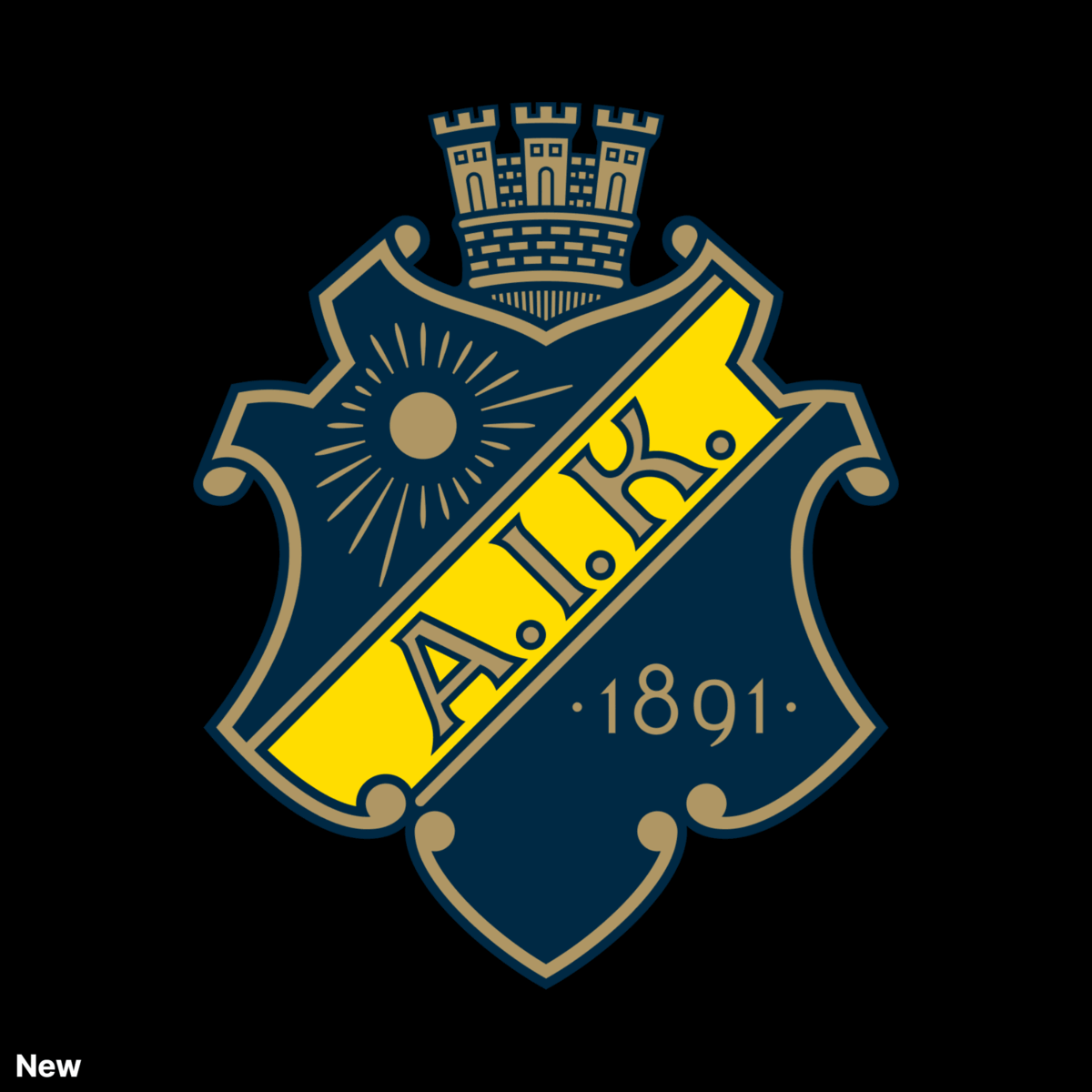
AIK Fotboll 2022 Logo
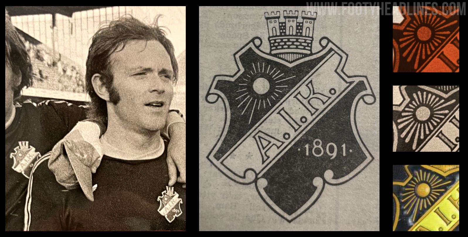
The new AIK logo is based on the original version from 1975. AIK decided to update their logo because the "previous original had details that were too fragile for print, difficult to see on a small screen and also some illogical execution of line widths and spacing".
AIK's goal with the club redesign was to have a new crest that fits the modern requirements while "being as close to the original from 1975".


Indeed, the new AIK logo looks almost identical to the previous crest if seen alone. The club also highlighted which elements have been updated, and why the club did so.

New AIK Logo - Changes


- Tower elements should have the same line width, roundings and spacing. Start from a circular grid that gives all the different parts the same perspective
- The sun's rays should become clearer, emanate from the center of the sun and be evenly distributed
- The end of the beam at the bottom left should be rounded
- The typography of the year is changed to AIK Numbers (they are the same numbers but fine-tuned by the font experts at Familjen)
- The blue and yellow colors become clearer
- Letters and spaces in the word picture AIK are fine-tuned
- The background is adjusted so that it is perceived as wide all around
- The scrollwork is adjusted so that it is not perceived as angular, but more teardrop shaped
You can find all about the restoration of the AIK logo on their website.


Do you like that AIK decided to only update their iconic crests instead of launching an all-new logo? Comment below.


