RB Salzburg Change International Logo
We have news from the Austrian Bundesliga, as Red Bull Salzburg recently altered their logo for international games, where they play under the name 'FC Salzburg'.
Die neue Saison in der Königsklasse kann kommen! 🔥
— FC Red Bull Salzburg (@RedBullSalzburg) June 15, 2022
Wir haben unser internationales Klublogo zur Saison 2022/23 überarbeitet und adaptiert.
Die Hintergründe erfährst du hier! ⤵️
New Salzburg International Logo
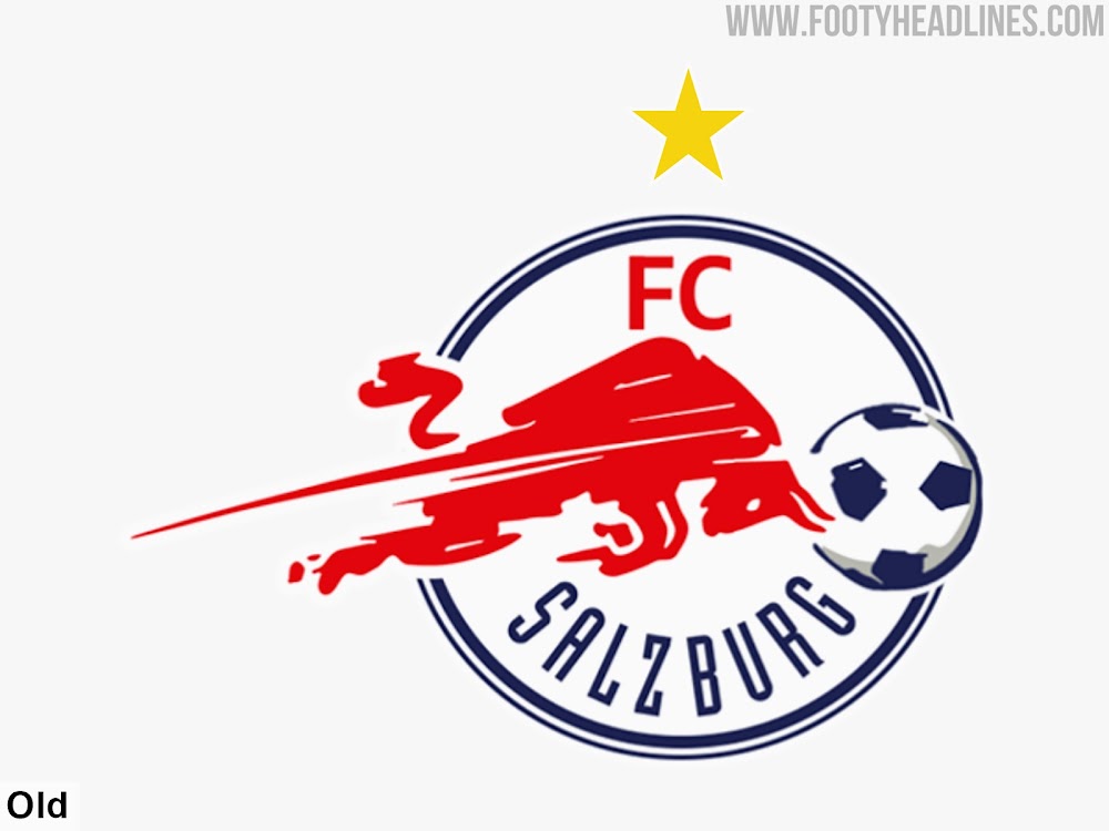
Released back in 2017, Salzburg's logo for international matches always seemed a bit rushed. It was designed in order to sufficiently distiguish the club its from close relative, RB Leipzig.

For the old version of Salzburg's international crest, only one bull was used instead of two, and placed inside of a circle. A substantial part of the bull however extends beyond the outline towards the left, making for an extremely assymetric design.
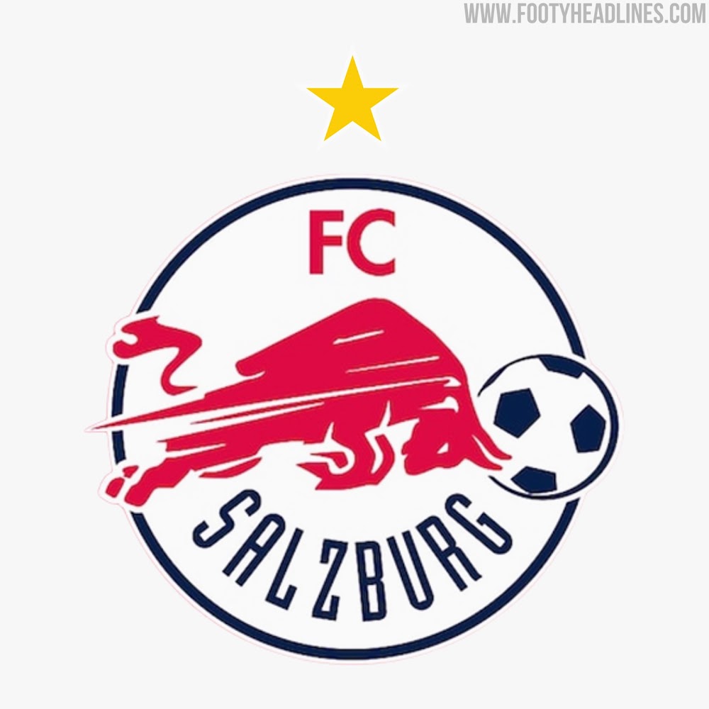
The new Salzburg crest tackles this problem by removing the lines behind the bull that indicate motion. The red bull is now almost entirely contained within the circle, resulting in the star being centralized.
In general, the reason for the change was to be able to display the club's logo at a larger scale, making better use of the space that is given to club crests on broadcasts and online.
Other minor changes have also been introduced, such as a single navy outline and a simplified design of the ball.
What do you think of Salzburg's new logo? Comment below.

