New Montedio Yamagata Logo Presented
Recently, J2 League club Monedio Yamagata presented their new logo. We wanted to take a look at all the changes that were made.

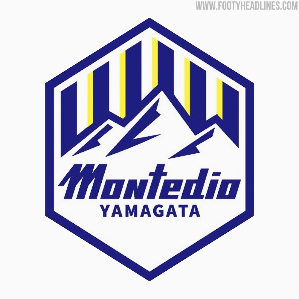
New Montedio Yamagata Logo
The new Montedio Yamagata logo presents several alterations compared to the old one.
Firstly, it removes all red from the badge, retaining the other colors, blue, white and yellow. The blue tone is slightly darker on the new logo, with the yellow remaining virtually the same shade.
Another major change is the shape of the club crest, which is now a hexagon rather than an oval. The border of this hexagon is blue and there is also a small gap between the blue, white and yellow stripes and the border.
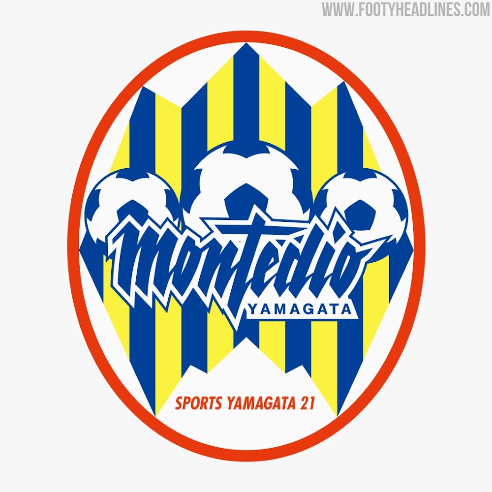
The central element of the logo is now a small mountain range rather than three footballs. The font in which "Montedio" is written was also changed slightly, retaining the slanted look of the original, but without the curves.
Overall, the new club badge features a lot less yellow and red than the older one, restricting itself to a more blue and white design.
What do you think of Montedio Yamagata's new club logo? Comment below.