All-New K.V. Oostende Logo Released
Marking 40 years since the creation of the club, Belgian club K.V. Oostende introduces a new look to their logo.
K.V. Oostende New Crest
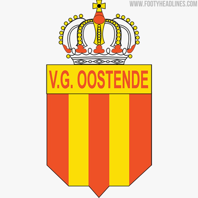
In 1981, two football clubs in the city of Ostend decided two merge, A.S. Oostende and V.G. Oostende, into K.V. Oostende. The new logo is innovative yet also a reminder of the past design.
Overall, the redesigned K.V. Oostende is very simplistic. The shield silhouette is a combination of A.S. Oostende and V.G. Oostende's old crests.
Inside the shield are the club's abbreviation KVO in green, red and yellow, the club's traditional colour. The letter V is taken from K.V. Oostende's logo in their early days.
"With our new logo we really want to step into a new era, but still keep our history, name and colours. It had to be sleek, professional, innovative and modern. The club's President Gauthier Ganaye commented.
"We surprised friend and foe last season with our attacking and fresh football and I think this logo is an extension of what we saw on the pitch: bold, driven and young. KVO is ready for the future in every way."
What's your opinion on K.V. Oostende's redesigned logo? We'd love to hear your thoughts below.


