Ultra-Rare Old Umbro Prototype Kits Revealed - Ajax, Manchester City & Rangers
Ever wondered what your favourite team's kit might have looked like before going on sales? Let us take you through some of the old Umbro prototypes of the late 80s' that never made it to the production phase. Big thanks to @VFshirts for getting their hands on them.
Ajax Amsterdam 89-90
These are the pre-production home & away jerseys.
The home shirt is not too far off from the final one with no red hoops on the cuffs. Also, instead of having the Umbro diamonds printed everywhere, the prototype had subtle diagonal stripes.
However, the away jersey is a totally different story. Initially, Umbro wanted to use a rather conventional look (for the 80s that was) with lines of horizontal diamonds running around the shirt, sparing the shoulders. But that was too simple for a team like Ajax, so they drastically changed the design.
Umbro decided to go wild. Geometric shapes, in red, white and blue, are placed almost everywhere all over the jersey. The only trace of the prototype is on the shoulder and part of the left chest with vertical white lines and blue background.
Depends on your taste, this is either out of this world or outright awful. But one thing for sure, the classic Ajax logo coming back to the 21-22 season is a welcoming sight.
While Ajax didn't adopt the Umbro away prototype, other teams did, notably Chelsea and Luton Town.
Manchester City 88-90
From one champion to another, take a look at the away Manchester City prototype.
In this instance, not much was changed except for a lighter colour scheme as the one on the pre-production shirt might have looked too similar to West Ham.
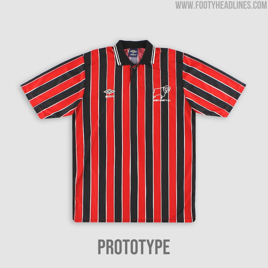
Derby County was supposed to get this template as well, but they chose to go for a, well, more radical approach and also way less red.
Rangers FC 87-90
Compare to the above prototypes, this one definitely has a more simplistic styling to it. Predominantly white with thin verticle blue stripes.
Across the chest are two horizontal red and lines with the latter dips down to make a V-shape on the right chest.
Rangers ultimately picked the diagonally split red and white design which resembles nowadays AS Monaco home jersey. Both the official and prototype shirts are great, though, we wonder what might have happened if Rangers went for the latter.
What do you think of these prototypes? Let us know what is/are your favourite design(s) in the comment section.


