Manchester United Redesign Concept by Marcos Prez
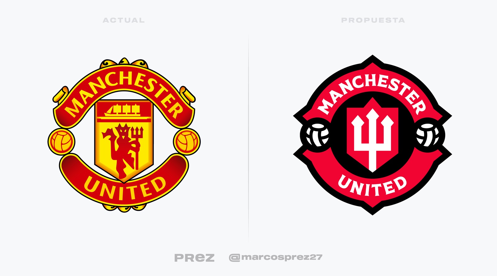
Manchester United last updated their logo in 1998. Now Argentine graphic designer Marcos Prez has created a redesigned Manchester United crest as part of a whole visual identity for the Red Devils.

Manchester United Redesign Concept By Marcos Prez
Inspired by the current club logo, the Manchester United concept logo keeps all the iconic elements but totally changes the visual look of them.

The yellow color is gone, in favor of a red, white and black color scheme. The devil and ship are replaced by an illustrated trident. The shape of the crest and other elements come with less detailing.
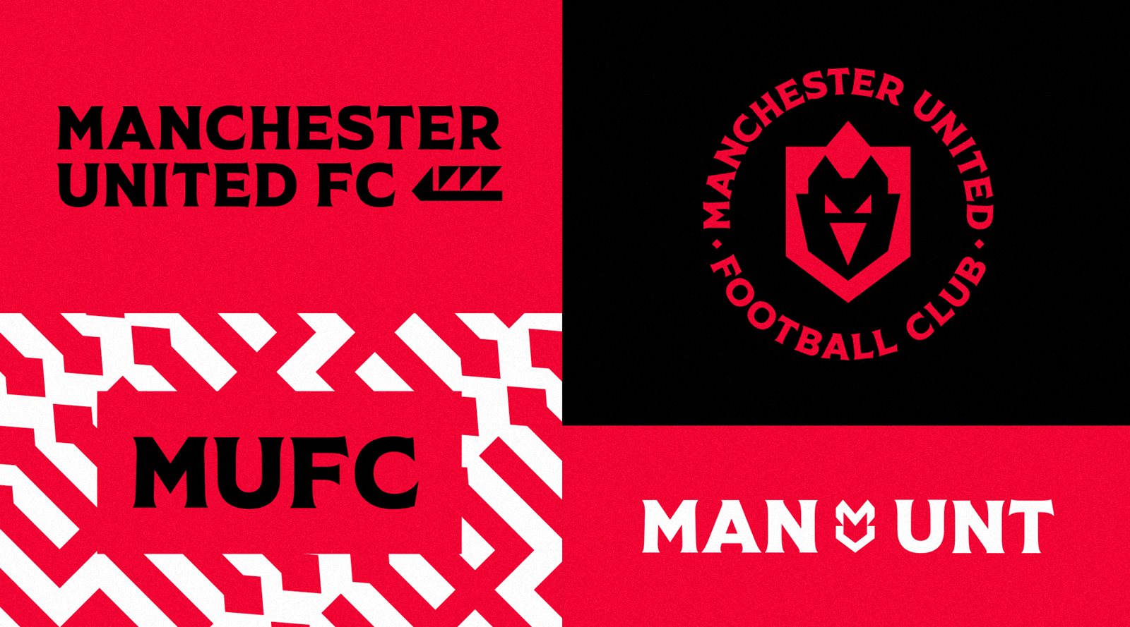


Marcos Prez also created some special icons inspired by the club's history, a typeface and visual graphic design.

Additionally, he also created differently colored version of the crest and a concept that replaces the trident with a simplified devil face.
There is not any news that Manchester United plans to update their crest in the near future.
Do you like the reimagined Manchester United logo and other visuals by the designer? Comment below.