8 Champions League Teams Who Could / Should Update Their Logo
When watching the UEFA Champions League yesterday night and seeing an overview of the matches of the Round of 16, a thought flashed through our mind - a few teams have somehow outdated logos that did not look greatly on the screen. We take a look at the teams we think could update their logo.
Logo changes are often very controversial, as is this article
We are aware that this topic is very controversial. Our article is only meant to contribute to the discussion of teams changing their logos and is not a call for any team to change the logo at all.
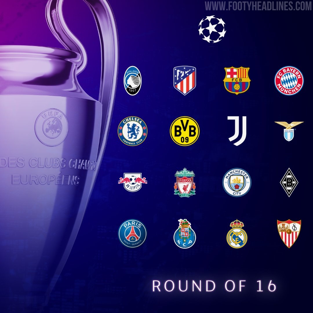
UEFA Champions League Last Sixteen Teams - Logos
In the past few months, not only many football teams have introduced new logos - most of the big companies updated their visual identities to match better the digital age.
3D effects were a think of the early 2000s
In fact, some of the current football logos have styles that are surely out of date - mainly 3D effects.
In fact, not only many football teams have introduced new logos in the past few years - most of the big companies updated their visual identities to match better the digital age.

Oddly enough, in the world of fashion and luxury, most brands already ditched their old-styled San Serif logos. This was made to shift their image from the old-world luxury, to a fresher and simpler ethos.


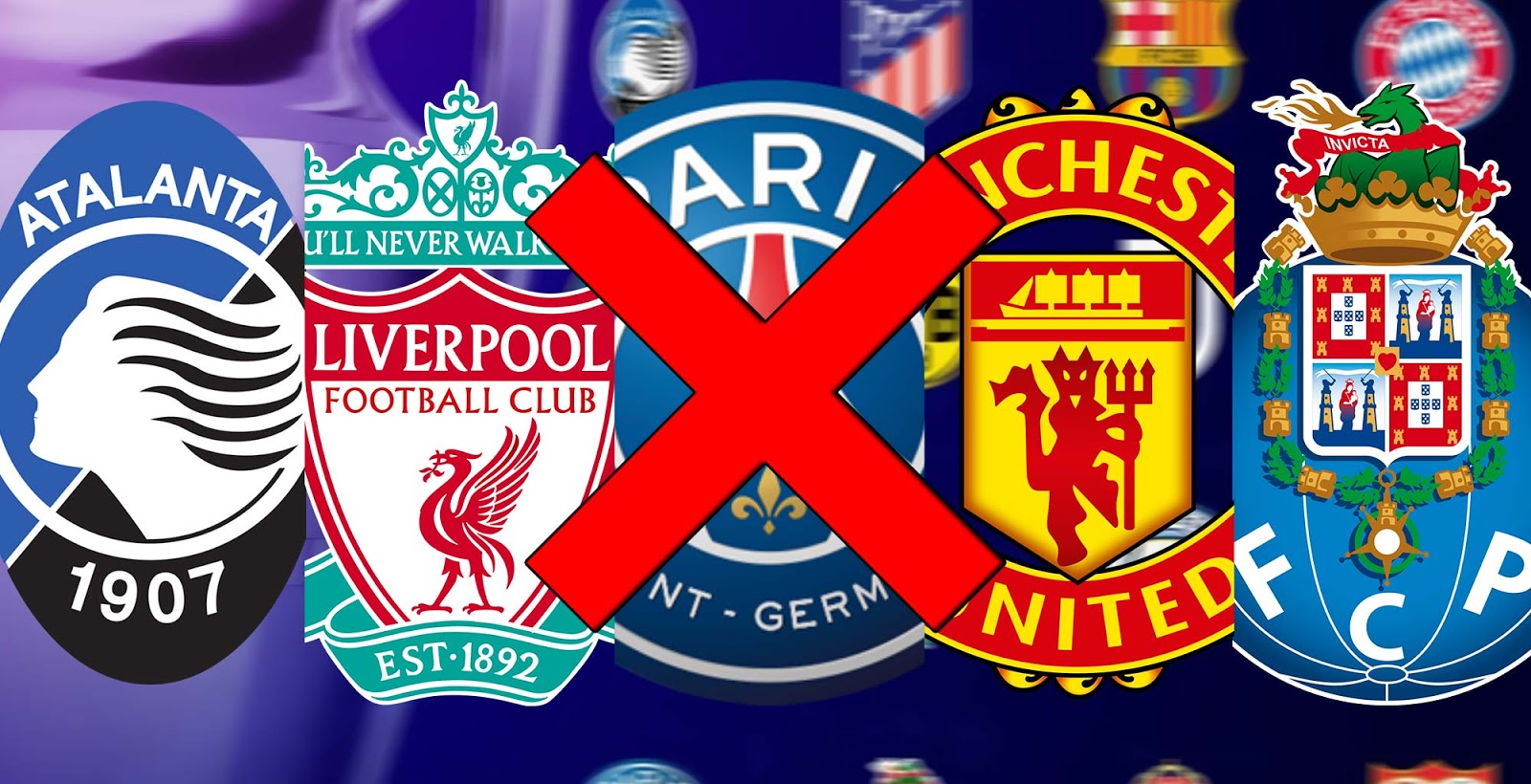
Atalanta BC

The Atalanta Bergamo logo was last updated in 1983 - the removal of the inner circle and a larger head would enhance the look.

FC Barcelona

The club already wanted to update their crest in 2018 - the elements itself (St. George's cross, Catalan flag, Blaugrana stripes) and shape would all have been kept, but the fans protested against the removal of the FCB lettering.

We think that a small update of the crest would work wonders - see the concept below, which greatly keeps the iconic design while adapting to the "new technologies".

Chelsea

Chelsea could remove the shadow effect of the lion and it would look better - just as it is on the kits.
Liverpool FC

Liverpool's branding has been inconsistent since they opted just for LFC crest instead of the regular club logo. We like the current club logo, however, so we do not think an update is needed in terms of design.

SS Lazio

Lazio's crest has some great elements but the ratio of them just are not perfect. A new logo boasting the eagle could look much better.
FC Porto

FC Porto's crest is one of those logos that feature a 3D gradient effect and a general early 2000s style. We think an update would be appropriate.
Paris Saint-Germain

There is nothing wrong with the PSG logo for us except one thing - the 3D gradient effect...
Manchester United (Not In Last 16)

Last updated in 1998, Manchester United's iconic crest includes some gradient designs and design styles that just look outdated. We think an updated crest could look better - their kits already come without all those gradient effects, and already with that it actually looks better.


Which of the last 16 Champions League teams will be the first to change their logo? Should Man Utd update their logo? Comment your guess below.