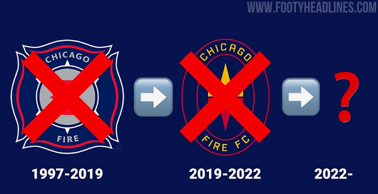
New Club Logo: Chicago Fire Announces Community Rebranding Process
Yesterday, Chicago Fire FC announced that the club will unveil an all-new identity soon, including a new club logo. Chicago Fire's latest crest & brand identity is only roughly one year old, but it was not received very well by the club's supporters and football fans alike. The club expects the new club logo to be ready in time for the 2022 campaign, the club's 25th in the MLS.

To finally create a brand identity that is worthy of Chicago Fire the club announced that they will cooperate with football fans and renowned designer @wolffmatt with an existing track record of designing new logos for clubs like LAFC, NYCFC or Racing Louisville FC.
Wolff also designed the 2018 World Cup kits for Nigeria and France. Of course, everybody knows how well those were received since one home jersey was virtually sold out everywhere and the other one lifted the World Cup trophy eventually.
Chicago Fire logo - 1997-2019
To incorporate Chicago and its nature Studio/lab's Chicago office will also work on the project. Interestingly, everybody, preferrably from Chicago, can submit a short message to participate in the rebranding process. There are three simple questions that can be answered: First, "What does Chicago mean to you", second "What does Chicago Fire FC mean to you" and third, "What do you want to see in the club's new crest?". This part of the rebranding process will be led by rEvolution, a company that is all about fan engagement opportunities.
Chicago Fire logo - 2019-2022
“Exactly one year ago today, I told our fans if the existing badge wasn’t working for them that we’d fix it - and that’s what we are going to do,” said Mansueto. “Fans have made their voices heard over the past year and now we’ll undergo a fan-focused process to create an identity that will stand for all Chicago for decades to come.”
“While we’ve assembled a talented group of brand and identity experts who love Chicago, it will be the fans’ voices that guide our work,” said Sheldon. “This project will be open and transparent and our sole focus is to create a crest for which all Chicago can be proud. We look forward to hearing from all who want to add their voice.”
Let’s collab, Chicago.
— Chicago Fire FC (@ChicagoFire) January 8, 2021
? https://t.co/qP1KEZS2v1 pic.twitter.com/HHM4lqPC7y
Finally, what is quite interesting is the fact that 4 stars surrounded by two sky blue lines are seen on the pinboard like website background that is only present on the pages dedicated to the rebranding process. We believe that it is possible that both Chicago football clubs will receive an identity that unites them. Another hint at unifying Chicago Red Stars with Chicago Fire FC is the writing that says 'A crest for all Chicago'. Obviously, it can also simply mean that the rebranding process is closely connected to Chicago since it is the flag of Chicago.
Chicago Fire FC 2022 Logo Draft - Current Progress visualised by @LoganFrommelt

What do you think of the upcoming rebranding process, and the involved parties? Are you excited for Chicago Fire's new logo? Let us know your thoughts in the comments down below, and learn more about Chicago Fire's rebranding commitment here.


