First-Ever J League Kit Typeface Launched - Inspired By Curve Kicks
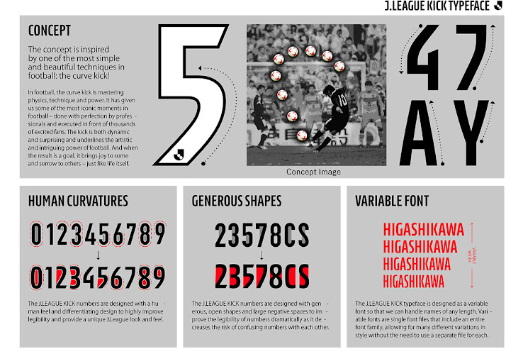
The Japanese J League will have a streamlined jersey typeface from the 2021 season, it has been announced this week. Introducing the "J.LEAGUE KICK" typeface.
J.LEAGUE KICK Typeface - New J League 2021 Kit Typeface
The new 2021 J League typeface takes inspiration from the curve kick - "The curve kick is a symbol of how football can bring people together".
The typeface (J.LEAGUE KICK) was designed by Kontrapunkt, a leading Scandinavian design agency, with a universal design and visibility.
The reason for the Japanese J League to have the same names and numbers for all team's kits is that "will give better visibility and improve the quality of watching J.LEAGUE matches".
J.LEAGUE Chairman Mitsuru Murai said: "The introduction of the "J.LEAGUE OFFICIAL NAME and NUMBER" aims to help everyone easily identify the players, while there is the growing trend of watching matches on smartphones and tablets along with watching at the stadiums. In addition, I hope it will lead to pay more attention and give interest to the players."
2021 J League Typeface - What You Need To Know:
・For all kits from the 2021 season - (J1 League, J2 League, J3 League, League Cup, J1/J2 Play-Offs, Super Cup)
・Typeface name:J.LEAGUE KICK
・Color used:White, Blue, Red, Black, Yellow
Do you like the new streamlined J1 League kit typeface? Comment below and find out more on Kontrapunkt's website.


