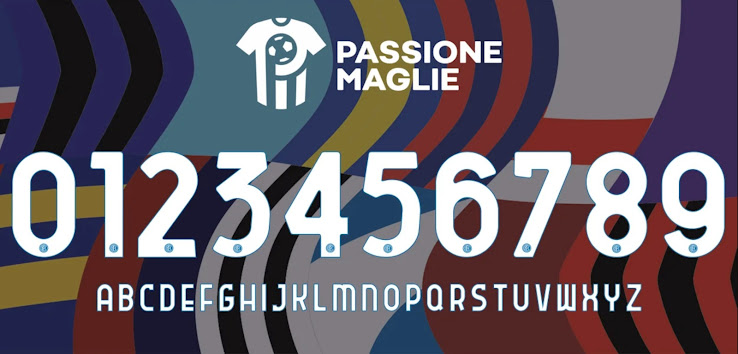
Font Expert: Here's Why the New Serie A Font is Bad
With the recent release of the Roma 20-21 home kit we finally got confirmation of the new league-wide font for Serie A.

But whether you like the idea of a one-for-all font - four out of five European top leagues have now one, with only the Bundesliga still allowing teams to have their own designs - there's no doubt that this one is not the best out there.
It's no secret that we at Footy Headlines are absolutely no fans of it. But if has to be done it should be done right. We believe that a league font should always try to reduce any sort of quirks or unusual design choices to a minimum, in order to not influence the appearance of shirts too much.
It might not be as bad as La Liga's with its overdone outline, but the new Serie A font has a number of issues. And they go beyond weird letter and number shapes, as a recent Tweet by font designer and expert @sportsfonts_com shows:
As highlighted, there's a lot of inconsistency with the new design, and that's only looking at the numerals.
- Some of them are titled to the right, such as the 2, 3 and 5, while the others aren't.
- Legibility could have been improved a lot by making sure that the shapes are not too closely aligned, as can be observed with the 6 and 9.
- Finally, the 8 'looks upside down'.
We wouldn't mind leagues going back to giving teams more freedom with font selection - but what do you think? Are you a fan of the new Serie A font and the concept of league fonts in general? Drop us a line below.


