Adidas 2018 World Cup Font Causes Controversy Again
Update: The Adidas 2018 World Cup font again made the waves on social media after some guys noticed that Inui's name is the same upside down. The Adidas font for the 2018 was also again criticized by many fans for being hard to distinctive.
japan living in 3018 pic.twitter.com/Ibu47zZqtA
— Dank Memes ??? (@FreeMemesKids) June 19, 2018
I am fully on board with this Adidas font for #BEL turning Mertens into MEATENS pic.twitter.com/50n8jiujKQ
— Brody Logan (@BrodyLogan) June 18, 2018
The font for these Adidas numbers is shocking. 11 or 17 or 77. (Obviously not 77 in the World Cup but still) pic.twitter.com/TyM9D7Rm0k
— Craig Williams (@craigawilliams) June 15, 2018

Adidas Gets Smashed For 2018 World Cup Font
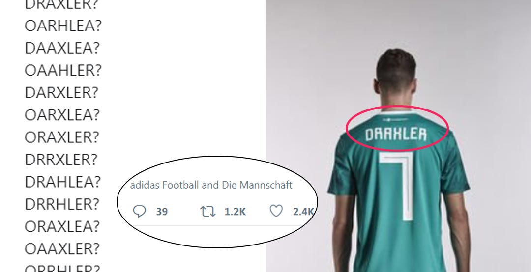
Adidas today released the new 2018 World Cup away jerseys for all of their sponsored national teams. The German brand also showed off a picture of Julian Draxler wearing the new Germany 2018 World Cup away jersey that made the waves on social media not because of the design of the jersey but because of the typeface.
Adidas Gets Criticized For 2018 World Cup Typeface
This perfectly illustrates the problem about this “typeface”.
— sportsfonts.com (@sportsfonts_com) March 20, 2018
Thanks, Julian …
OAAXLEA?
DARKLER?
ORAHLEA?
DAAHLER?
ORAXLER?
ORAHLER?
DRAXLER?
OARHLEA?
DAAXLEA?
OAAHLER?
DARXLER?
OARXLEA?
ORAXLER?
DRRXLER?
DRAHLEA?
DRRHLER?
ORAXLEA?
OAAXLER?
ORRHLER?
DARHLEA? pic.twitter.com/YqJIyIpxyw
The Adidas 2018 World Cup typeface was already unveiled last November, but it was the new picture of Julian Draxler that made the typeface famous in the internet because of its not nearly perfect distinctness of different letters and numbers....

The Adidas 2018 World Cup typeface is inspired by traditional Soviet imagery. The font has a certain rawness and cutout style to it and doesn't include any sort of roundness.
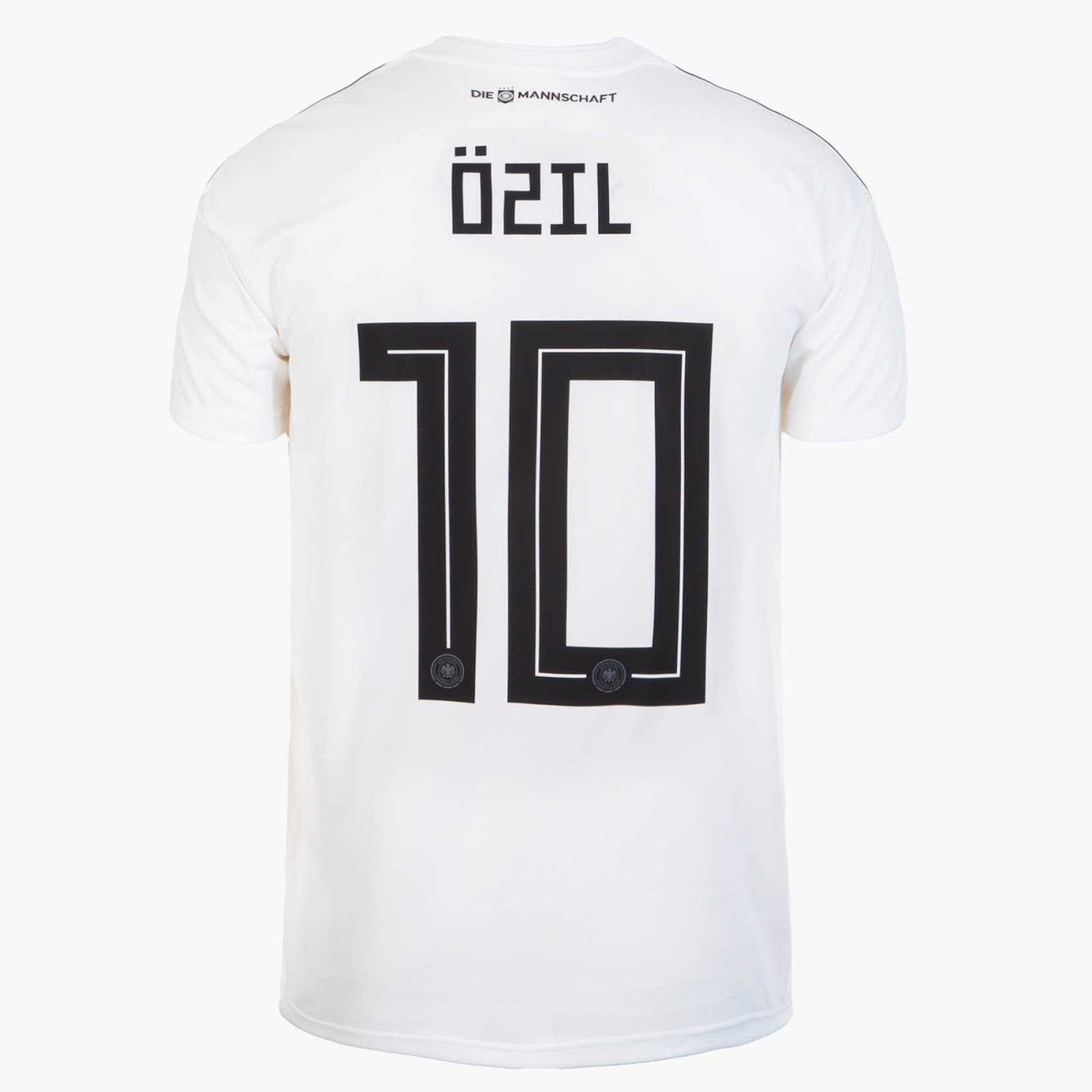
In fact, many letters of the Adidas 2018 World Cup font can be easily misidentified, and some letters like the Z look exactly the same numbers (2).
What do you think of the Adidas 2018 World Cup font? Let us know in the comments below.