Interview With Adidas Manchester United Kit Designer - The Secrets of Man Utd's New Kits

Adidas senior designer Inigo Turner talks about the inspiration and the hidden details of the new Manchester United 15-16 Kits, which are the first produced by Adidas following their record-breaking £750m deal.
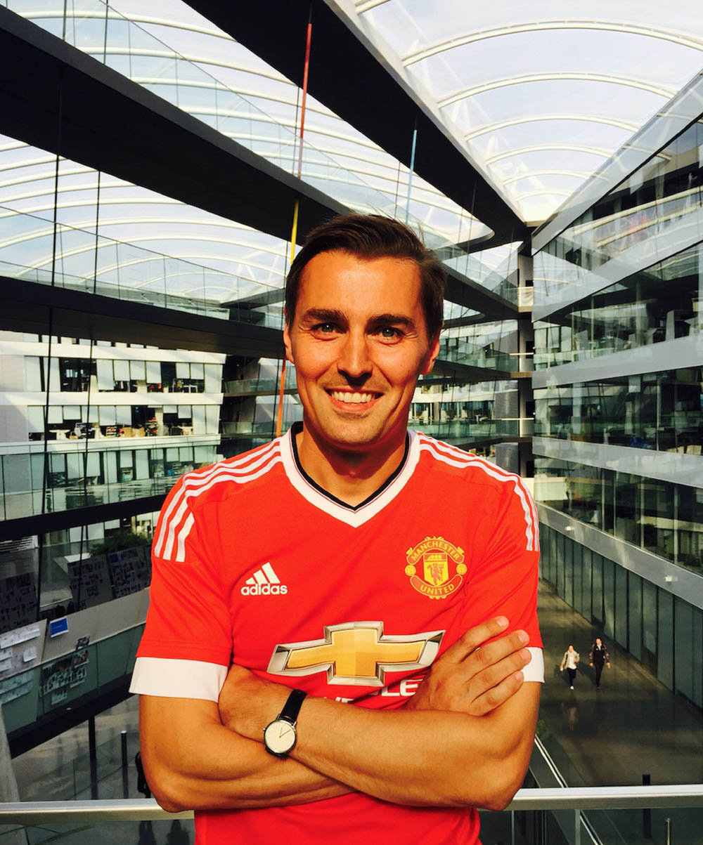
Inigo is a lifelong Manchester United fan and responsible for the new Adidas Manchester United 15-16 Home, Away and Third Kits.

Adidas Manchester United Kit Designer Interview
Inigo designed the new Man Utd 15-16 Home Kit.
How many people are involved in the planning, developing and making of the kit?
Not so many. In terms of the content itself, usually from over here, we have myself as designer and my superior and we'll share it among the teams. We have around eight designers, our marketing colleagues and the product manager. Development are the guys who actually make the jersey come to life in the end. Obviously, we also run it through our communications department as well because they produce the material you see in videos and the printed media.
Why the classic look?
We have a few directions and then discuss it internally and see which one best fits the story we want to tell. We're pretty confident with the whole story about the two partners coming back together that this was a clear direction and one we're really comfortable with.
It was crucial that the red used is correct.
We felt the first jersey back should be a celebration of this so it needed to be red, the v-neck was very iconic and very much a Manchester United adidas shirt and, obviously, just the three white stripes. This means, on a very basic level, this was a clear winner. It wasn't so difficult in the first season because we've waited a long time and wanted to celebrate the look of us both together.
Is there a certain type of red used on the strip?
It is called 'real red'. It was crucial that the red used is correct. The club has an archive of jerseys, all of which have a similar red to them, so we wanted the color which United are synonymous with now and also the one which is close to the one we had in the past. So it involved looking at the current red and then checking it against the one we had on the old adidas shirt. They're not actually that far apart so we chose one which fits for both. It's a unique red for the club and we hope the fans will like it.


The colors of the away kit are definitely not set
What are the future plans for the away kit?
The colors are definitely not set as the away strip changes more than the home kit. The away ones are always an area where we can try new things and it's usually an important discussion with the club. There is more of an experimental process. For instance, the adidas designs in the early nineties were marmite jerseys, so you either loved them or hated them, but they have become quite iconic now.

Tell us some secrets of the new kit...
The blue away strip between 1990 and 1992 was a key thing we wanted to include in the shirt. On the hem of the waist on the home jersey, we have this debossing and it's the 'M' graphic from the kit we all remember from the 6-2 win at Arsenal and the Rumbelows Cup final success as this was the inspiration point for that. We wanted to have cues to the old jerseys and show we'd looked into the past and re-imagined them into a modern shirt or re-interpreted it.
The overall look of the kit was inspired by the 1982 jersey
The 1982 jersey inspired the overall look of the shirt with the v-neck and colored engineered collar, which is tipped red and black and then the white cuff. The waistband was more of a subtle nod to that 1990s away shirt but it brings an extra level of detail on the kit which the fans will notice, not at first glance, but understand the reference later on.

What about any technology used in the shirt itself?
The actual fabric on the front panel is this hoop stripe. This is a ventilation structure which is ventilating the players more so it’s basically designed to increase player performance and ventilation whilst they’re playing. There is engineered fabric on the front panel on the shirt that fans can buy, but the actual one the players wear will be the adizero, which is the lightest jersey we offer at adidas and is designed to make the players run faster and play faster.

Is there anything different about the back of the shirt?
We came up with a font specifically for United [for the name and number] which was inspired by the one worn on the 1982 jersey. The shape of it was very iconic and we really want to have a holistic look to the kit. Obviously in the Premier League, United will wear the Premier League fonts but this is more for European competition. We worked together with the club and they really liked the holistic package and the thought that went into everything in the jersey. The overall look of the kit was inspired by the 1982 jersey and re-imagined and, then again, the same with the font. We used that but turned it into something relevant and modern.


